Banner

Monday, 21 December 2009

N97 mini v/s HTC G1 Comparison


Continuing where I left off in my last post about the unboxing of the N97 mini , this post is going to be about comparing the N97 mini with the Google HTC G1.Why ?
Well ..for starters , both the phones have a nice large 3.2 inch touch screen , both have slide out qwerty keyboards and both sell at almost the same price point (without contract) . I shall be covering various aspects of both the phones with a conclusion in the end.


  1. External appearance :
    There is no doubt as to who is the winner in this department. I don't even think the guys at HTC made the G1 to appeal to any design conscious person. The battery cover too feels very plasticky and cheap. The N97 mini on the other hand looks beautiful. The bezel finish and metallic rims give it a very sturdy feel. The G1 is also a little bit wider and thicker which also leads to its overall bulky appearance.


    The nokia engineers really did a good job of making the N97 mini much smaller than its big brother the N97 , and at the same time , not compromising in the looks department

      Winner : N97 mini


  2. Camera :
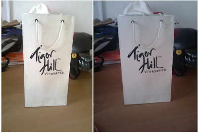
    The Nokia N97 mini comes with a Carl Zeiss 5 megapixel camera with a dual led flash. The HTC G1 on the other hand has just a 3.2 megapixel camera with no flash, so this isn't really a fair comparison. As expected the Nokia N97 mini smokes the competition with its superior detail , lesser noise and better low light photography.


    The picture on the left was clicked by the N97 mini and the one on the right by the HTC G1. As you can see there is an obvious difference in the quality of the picture and the colours.


    Winner: N97 mini


  3. Keyboards
    Both the N97 mini and the HTC G1 have good QWERTY keyboards, although here, it might all boil down to a matter of personal preference. For eg. The G1 has a four row layout compared to the 3 row layout of the N97 mini.


    For me, personally, although the N97 mini had bigger rubbery keys, it took some time to get used to the three row format. Plus having the space bar on the right was a bit weird and took time getting used to.
    Another obvious advantage of the N97 mini over the G1 is the ability to use it with its keyboard out resting flat on the table. The inclination of the screen makes for comfortable viewing and it's really good if you want to type out lengthy emails or just scroll through some WebPages. The G1 keys feel like plastic and the feedback is not as good as that of the N97 mini's rubberized keypad.

    Although the G1's keyboard is more functional and spaced out, I would award this round to the N97 mini's keyboard for its feedback and comfortable rubberized keys.


    Winner: N97 mini


  4. Software and User Interface
    The N97 mini runs on the Symbian touch screen OS or S60 v5 as it is commonly known as. The HTC G1 on the other hand rus on Android OS and was the first android based handset to be released. I'm a big fan of the S60 v3 (the non touch screen ) version of the symbian OS and I was excited when symbian announced that they would be porting the OS to the touch screen devices. But , after playing around with the 5800 , the N97 and the N97 mini , I was really disappointed. The OS is pretty laggy and buggy for my liking and the single and double clicks are not consistent at all. Ie in some places you would have to single tap to perform an action and in some you would have to double tap to do the same. Sometimes I would single tap and wait for something to happen only to realize that I need to double tap in quick succession for the action to be performed.


    That's the homescreen of the N97 mini on the left and the homescreen of the HTC G1 on the right. The N97 mini allows you to add widgets to the homescreen , but so does the G1. In fact the customizability options with the G1 are much more and allow you to totally modify the way your OS operates via custom ROM's , which is not at all possible with the N97 mini.

    Winner: HTC- G1


  5. Messaging
This is another area about the N97 mini that really disappointed me . I don't get it what nokia could not implement a qwerty keyboard on the touchscreen itself. If Android can do it on the G1's 3.2 inch screen , then why can nokia do it on the N97 mini's 32 inch screen ? Its so stupid to have a touchscreen based OS and then only offer a touchscreen keypad based text input instead aof a touchscreen qwerty keyboard. Another disappointment is that in the landscape mode of the N97 mini , the only text entry option you have is the slide out qwerty keyboard. No qwerty keyboard onscreen as is the case with the HTC- G1.


That's the text entry method of the N97 on the left and the qwerty keyboard text entry method of the HTC g1 on the right. Both are in portrait mode , and yet Android has a full qwerty soft keyboard , whereas nokia just managed to fit in a numpad based one. Is this a technical limitation of the resistive screen that the N97 mini has ? I don't know. But it is definitely something that's a big minus in my opinion.


On a positive note , the N97 mini has the option of handwriting recognition as an input method and I must say I was pretty impressed by the way it recognized even the most badly scribbled alphabets. On the downside , this method of text input tends to get tedious and time consuming , and I cannot imagine using it on a daily basis , especially if you text a lot.


A plus point for android was the availability of the soft keyboard even in the landscape mode. That way , you are not compelled to slide out the keyboard for every small text entry while surfing the web and quick replying to sms messages. You might not realize this as first , but this feature grows on you and you will find it indispensable after a few days of usage.

The lack of an onscreen qwerty keyboard in both portrait and landscape mode of the N97 mini was a big drawback and the HTC G1 deserves to be the winner of this round.

Winner: HTC- G1


6. Dialer

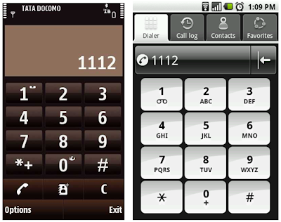
The dialer of the N97 mini is a pretty standard one . As you can see from the picture on the left below , it just has the option of dialing numbers or saving the number you have just typed as a phone number.


The Android dialer on the other hand has much more options. You can access your contacts , last dialled numbers and favourite contacts from the dialer itself. This is really a great timesaver and you once you get used to it you will seriously wonder how you managed without such a setup for so long.


Winner: HTC- G1


7. Appstore

The Nokia N97 mini has a preinstalled Nokia Ovi store app which allows you to download applications from the ovi store. Similarly the G1 comes with the Google Android marketplace preinstalled. On first glance both the app stores look really similar with similar menus and rating systems, but the Android app store definitely has a bigger developer base and there are a lot more functional apps present for the android phones than there are for the nokia phones on the ovi store


That's the Ovi store on the left and the Android marketplace on the right.


Here again the G1 wins this round because the Android market has more number of unique functional apps as compared to the Ovi Store.


Winner: HTC- G1


 8. Internet browsing

Internet browsing is a mixed bag. The nokia N97 mini fared well on some sites whereas the g1's browser was better at some. But the obvious signs that the webkit browser needs a major overhaul are obvious. Sometimes the links on the Nokia N97 mini appeared so small that I had to click on them with a fingernail , and the very same links rendered beautifully on the G1's browser . Another weird thing I found about the N97 mini's browser was that it would not let me click on the tabs on the top of the screen where I accessed m.dabr.co.uk in fullscreen portrait mode , but it would let me do it in landscape more. Again here… the lack of an onscreen qwerty keyboard while surfing on the N97 is a noticeable exclusion and sliding out the physical keyboard for every little text entry in landscape mode gets irritating at times.


That's the web browsing experience on the N97 mini on the left , and the android G1 on the right for the site www.bbc.co.uk


Winner: HTC- G1


9. Flash player


I must say that the ability of the N97 mini to play flash files within the browser itself was a surprise feature I wasn't even aware of untile I visited youtube. The HTC G1 doesn't play flash files and opens the youtube videos via the video player app. The ability of the N97 mini to play flash files via the browser itself makes it very convenient to watch youtube videos without navigating away from the page you are on 


The youtube experience on the N97 mini above, and the experience on the G1 below


Winner: N97 mini


10.  Maps and GPS

The Nokia N97 ships with the latest version 3.0 of Ovi maps and the Htc G1 ships with the android version of google maps. Both these mapping softwares can be synced to your online accounts so you can sync routes you created on the web based account to your mobile devices. One important distinction is that google recently started offering turn by turn voice guided navigation for free on all android handsets in the USA , while for Nokia maps turn by turn and voice guided navigation comes at a premium and you have to pay for it.


That's Nokia maps 3.0 on the left and the Google maps application for android on the right. Personally I found the google maps application to be faster . The G1 took hardly about 5-10 seconds to get a good gps lock outdoors while the N97 mini took about 30 seconds for the same. Even indoors , the G1 was quicker to locate me via cell tower triangulation and GPS positioning than the N97 mini.
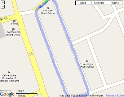
I decided to put the GPS sensitivity to the test by using the sports tracker app on the N97 mini to track one of my jogs , and I decided to use a third party app called Cardio trainer to do the same on the G1.


The track above was recorded by the N97 mini's sportstracker app


The same track recorded by the Cardio trainer app on the G1.

As you can see , the results speak for themselves. The GPS chip on the G1 is far more sensitive and the G1 is capable of getting a more stable lock on the satellites than the N97 mini.

Winner: HTC- G1


Overall Score : Htc G1 - 6 || Nokia N97 mini - 4


So there you have it . Of the 10 categories the devices were compared on , the G1 won 6 of them and the Nokia N97 mini won 4. The interesting part is that most of the areas where the N97 mini lost out were due to the software . In fact , the form factor, the keyboard , the camera of the N97 mini are much better than those of the G1 , but where Nokia fails in creating a successful blend of its awesome hardware with the software , android succeeds in doing just that. I really wish nokia had developed a maemo like operating system for the N97 mini and not gone with the S60 v5 version of symbian. The s60 v5 version of symbian feels more like a stop gap measure by nokia in response to the Apple iphone while they were working on getting maemo out to the masses. I seriously feel that Nokia has to pull its socks up and either go for a revamp of the S60 v5 operating systems , or ditch it and go with maemo for all its touchscreen devices, otherwise …we are just going to have more phones like the N97 mini , where the awesome hardware is only limited by the poor software it is running.


    Thursday, 3 December 2009

    N97 mini Unboxing

    The awesome people over at Nokia Womworld sent me a N97 mini to trial.  Now I've been hearing all sorts of mixed reviews about its elder sibling the Nokia N97 , and i wanted to see for myself how the little brother stacks up against it. Here are some of my initial observations during the unboxing :

    1. The packaging 

    Nokia has really gone forward and taken the "mini" concept to a whole new level. The packaging is neat and slim. I have compared the sizes of the boxes of my N95 and the N97 mini just to give you a brief idea of how slim the box is. Nokia has really pulled of a wonderful "Mini" marketing strategy with this one.


    I think thats what the "Experiment #097" is all about , "experimenting with smaller packaging". I think that this is a positive step and I would love to see other N-series phones ship with minimalistic space saving packaging too.

    2. The Contents

    As soon as you open the box , you will see the N97 and powerful BL4D battery resting comfortably in the plastic casing.


    Beneath the plastic casing you have the product manuals , the OVI suite installation dvd,  the USB to micro USB cable ,  the charger and the Nokia WH-701 headset.


    One thing that I have observed is that Nokia loves to change the type of headset it provides with every N-series handset , but this is the first time I have come across a N-Series handset with "in ear" earphones with silicone buds , rather than the standard "ear bud" earphones. I've always had a problem with the traditional earphones that all the other N-series handsets came with as the kept popping out of my ears while jogging. The WH-701 comes with a set of adjustable silicone ear plugs that can adjust to any ear size. Even though the N97 is not a music centric phone , I am very pleased that Nokia decided to provide the WH-701 headset with the N97 mini.


    3. The Handset

    The N97 mini is gorgeous. The bronze finish makes is look real classy. Much like a mixture between the sharp E series and the playful N series.
    The N97 mini feels sturdy in the hand and has a very sturdy "snap" sound when you slide the keypad open and close it. Overall , from the exterior , the phone feels like it was sturdily built and there are no creaks and groans or wobbly sliders as was the case with the N95 when it was launched. Over the years Nokia seems to have perfect the qwerty slider mechanism and its latest sliders - The E75 , the N97 and the N97 mini seem to be proof of just that. The Carl Zeiss 5 Mega pixel cam takes decent pictures , although I did click a few and found them to be pretty grainy. I dont know if this is because of the plastic scratch guard on the lens. I'll probably put it head to head against my Nokia N95 (which in my opinion is still the best camera-phone ever made by Nokia !!)


    Well, This was a brief unboxing of the Nokia N97. I am thinking if  writing a comparison review of the N97 mini  v/s the Android G1. What do you think readers ? Would you like to see how the N97 mini matches up against the Android G1 ? Please leave your opinions and suggestions in the comments.

    Wednesday, 2 September 2009

    Nokia launches Nokia X6 , Nokia X3 and Nokia N97 mini at Nokia World 09

    The Nokia X6 - Music just got a whole lot more interesting, with the introduction of the Nokia X6. 3.2-inch touchscreen? Check. 32GB of storage? Check. 35 hours of music playback? You guessed it, that’ll be a check. Did we mention the blow-your-mind design? We’ve only just clapped eyes on the sleek and sexy X6 and already we can’t keep our peepers off it. At a touch under 14mm thin, it’s slim frame packs plenty of power and will leave music lovers in no doubt as to how they’ll be listening to music on the move when the device goes on sale this side of Xmas. What’s more, the Nokia X6 is a Comes with Music device which means you’ll be able to tune into as much all-you-can-hear music as you like without having to spend a penny extra.


    The 3.2-inch widescreen display is optimised for photos and videos, proving the Nokia X6 is more than just a musical masterpiece. Pack 20 friends onto your homescreen, along with communities such as Facebook and it’s also a fully connected social butterfly.
    Did we mention the 35 hours of music playback? Well what about 16 days standby time, a 5-megapixel camera and Carl Zeiss optics, dual LED flash, TV-out, video editing, online sharing, Nokia Music store, full web browser and Flash Lite support. Still want more? Okay then, A-GPS, Ovi Maps and Playlist DJ. If you fancy a bit of gaming, then Spore is included, along with DJ Mix Tour and Asphalt4. Phew.
    The addition of this device to Comes with Music takes music on the move into a totally new dimension. And we’re pretty excited about it.
    The Nokia X6 is expected to ship in the fouth quarter of 2009 for an estimated retail price of EUR459 before taxes and subsidies.


    Nokia X3 - Joining the all-new Nokia X6 music device is the new Nokia X3, the first Series 40 device to come Ovi Store enabled. Sharing some of the X6’s design cues, the Nokia X3 slider sports a 3.2-megapixel camera, a diminutive frame and 2.2-inch screen. Stereo speakers, dedicated music keys and support for up to 16GB of storage via microSD card make for a nifty mobile music device. The X3 also sports an active homescreen where users will be able to see their contacts, friends and current music playing. Music lovers will also be able to continue listening on flights thanks to flight mode.


    Bluetooth 2.1 is supported with stereo audio profiles for wireless musical enjoyment. Wire fans will be able to use standard headphones thanks to the 3.5mm headphone jack. Full speed USB 2.0 makes music transfer quick and easy and music can be managed via the Ovi Player PC client and Windows Media Player 11.
    Messaging is well supported too. Alongside a common inbox for SMS and MMS in conversational view, Nokia Xpress Audio Messaging is supported and Nokia Messaging 2.0 brings users’ existing email and IM accounts to the device.
    The Nokia X3 goes on sale in the fourth quarter of 2009 for an estimated retail price of EUR115 before taxes and subsidies.


    Nokia N97 Mini -  Following in the footsteps of its bigger, older brother, the Nokia N97 mini was unveiled  at Nokia World 09. Sporting new homescreen widgets and a host of usability improvements, the N97 mini still packs 8GB of storage, a 3.2-inch touchscreen and full QWERTY keyboard into its 14.2mm thin frame. It’s also the first Nokia device to sport Lifecasting with Ovi – a new partnership with the world’s largest social network, Facebook. The N97 mini is based on the same tilt display design of its N97 big brother, built into a smaller body complete with new design touches.


    Lifecasting enables users to update their Facebook status directly from the device’s homescreen. It doesn’t stop there though as location details can also be updated, enabling a whole new level of social sharing and communication. With the ability to completely customise the homescreen, users will be able to make their N97 mini truly unique.
    The 3.2-inch touchscreen opens up a new world of software improvements including flick scrolling and a range of new experiences including new homescreen widgets. What’s more, the software update will also be available next month for existing N97 devices.


    The Nokia N97 mini works seamlessly with Ovi Store where users can add new applications, widgets, ringtones and other content to their device. It also sports Ovi Maps and comes with integrated A-GPS and compass along with with voice navigation for driving or walking. Over 155,000 points of interest are also available through Lonely Planet guides and restaurants through Michelin Guides.


    Up to 12 days standby time are on offer and up to 28 hours music playback (in offline mode). The 5-megapixel camera comes with dual LED flash and video light, along with a Carl Zeiss Tessar lens. The 8GB of on board memory can be expanded to 24GB with the addition of a 16GB microSD card.
    The Nokia N97 mini will be available next month for an estimated retail price of EUR450 before taxes and subsidies.

    Thursday, 27 August 2009

    Nokia Announces N900 Maemo based handset !!


    Nokia today marked the next phase in the evolution of Maemo software with the new Nokia N900. Taking its cues from the world of desktop computing, the open source, Linux-based Maemo software delivers a PC-like experience on a handset-sized device.
     

    The Nokia N900 has evolved from Nokia's previous generation of Internet Tablets and broadens the choice for technology enthusiasts who appreciate the ability to multitask and browse the internet like they would on their desktop computer.
     
     
    Running on the new Maemo 5 software, the Nokia N900 empowers users to have dozens of application windows open and running simultaneously while taking full advantage of the cellular features, touch screen and QWERTY keyboard.
     
    "With Linux software, Mozilla-based browser technology and now also with cellular connectivity, the Nokia N900 delivers a powerful mobile experience," says Anssi Vanjoki, Executive Vice President, Markets, Nokia. "The Nokia N900 shows where we are going with Maemo and we'll continue to work with the community to push the software forward. What we have with Maemo is something that is fusing the power of the computer, the internet and the mobile phone, and it is great to see that it is evolving in exciting ways."
     
    Designed for computer-grade performance in a compact size, Maemo complements Nokia's other software platforms, such as Symbian, which powers Nokia's smartphones.
     
    "Just as Nokia continues to expand and diversify its device portfolio, so it is deploying multiple platforms to allow it to serve different purposes and address different markets. While we have seen continued growth in Symbian as a smartphone platform, Maemo enables Nokia to deliver new mobile computing experiences based on open-source technology that has strong ties with desktop platforms," says Jonathan Arber, Senior Research Analyst in Consumer Mobile at IDC.


    More multitasking with Maemo
    The Nokia N900 packs a powerful ARM Cortex-A8 processor, up to 1GB of application memory and OpenGL ES 2.0 graphics acceleration. The result is PC-like multitasking, allowing many applications to run simultaneously. Switching between applications is simple, as all running content is constantly available through the dashboard. The panoramic homescreen can be fully personalized with favorite shortcuts, widgets and applications.
     
    To make web browsing more enjoyable, the Nokia N900 features a high-resolution WVGA touch screen and fast internet connectivity with 10/2 HSPA and WLAN. Thanks to the browser powered by Mozilla technology, websites look the way they would on any computer. Online videos and interactive applications are vivid with full Adobe Flash(TM) 9.4 support. Maemo software updates happen automatically over the internet.
     
    Messaging on the N900 is easy and convenient thanks to the full physical slide-out QWERTY keyboard. Setting up email happens with only a few touches and the Nokia Messaging service mobilizes up to 10 personal email accounts. Text message or IM exchanges with friends are shown in one view and all conversations are organized as separate windows.


    The Nokia N900 has 32GB of storage, which is expandable up to 48GB via a microSD card. For photography, the Maemo software and the N900 come with a new tag cloud user interface that will help users get the most out of the 5MP camera and Carl Zeiss optics.
     
    The Nokia N900 will be available in select markets from October 2009 with an estimated retail price of EUR 500 excluding sales taxes and subsidies. The Nokia N900 will be displayed at Nokia World, Stuttgart, on September 2. More information on Maemo is available athttp://maemo.nokia.com.

    Tuesday, 25 August 2009

    Nokia Launches 5230 ..Possibly the first Sub Rs.10K Touch handset?


    Nokia has just popped open its paint pot and pulled out the new Nokia 5230 in a range of custom colours. The latest handset to join the touchscreen fold, the Nokia 5230 has been designed to serve up slick on-the-go entertainment, location-based services and act as an easy pocket portal for social networking at low cost.
    Brandishing a 3.2-inch widescreen touch display with full-screen QWERTY keyboard and handwriting recognition, the Nokia 5230 is geared up to enable you to rattle out messages at speed. Paired with speedy HSDPA connectivity, this means staying in the loop and keeping your Facebook and Twitter streams promises to be a no-wait affair. Ovi Store is nestled neatly on the homescreen from the moment you switch on the device, ensuring you can get instant anywhere access to quality bite-size apps.
    Music is its first love though, with the 5230 bringing 33 hours of playback time (long battery life was recently voted the most important feature in a music phone by you guys – so we’re stoked to see that), a 3.5mm headphone jack and memory expandable up to 16GB via a microSD card. Two versions of the phone will launch – a standard device costing 149 Euros, and in some select areas a Comes With Music version will be available for 259 Euros for those keen on all-you-can-eat downloads.
    Jo Harlow is Vice President at Nokia, and had this to say about today’s news of the upcoming 5230:

    “Competitively priced at 149 Euros, we believe the Nokia 5230 is an unbeatable offer for many new customers who aspire a device that stars in music, mingles with social networks from Facebook to MySpace, navigates you to where it happens, when it happens, and comes in array of dazzling colors”

    Other features include assisted-GPS with Ovi Maps, Nokia’s new Contacts bar on the homescreen, a 2 megapixel camera and Bluetooth 2.0.

    Monday, 24 August 2009

    Nokia Announces Nokia Booklet 3G Netbook.

    After more than 25 years as a pioneer and leader in the mobile industry, Nokia will bring its rich mobility heritage and knowledge to the PC world with the new, Windows based, Nokia Booklet 3G.


    Powered by the efficient Intel Atom processor, the Nokia Booklet 3G delivers impressive performance with up to 12 hours of battery life, enabling people to leave their power cable behind and still be connected and productive. Delivering the rich experience of a full-function PC inside an ultra-portable aluminum chassis, the new mini-laptop weighs 1.25 kilograms, measures slightly more than two centimeters thin, and has the features one would expect from the world's leading mobile device manufacturer.  A broad range of connectivity options - including 3G/ HSPA and Wi-Fi - gives consumers high speed access to the Internet, including Nokia's broad suite of Ovi services, and allows them to make the most of every moment and every opportunity.  

               
    "A growing number of people want the computing power of a PC with the full benefits of mobility," said Kai Oistamo, Nokia's Executive Vice President for Devices. "We are in the business of connecting people and the Nokia Booklet 3G is a natural evolution for us. Nokia has a long and rich heritage in mobility and with the outstanding battery life, premium design and all day, always on connectivity, we will create something quite compelling. In doing so we will make the personal computer more social, more helpful and more personal."
    The mini-laptop also comes with an HDMI port for HD video out, a front facing camera for video calling, integrated Bluetooth and an easily accessible SD card reader. Other premium features include the 10-inch glass HD ready display and integrated A-GPS which, working with the Ovi Maps gadget, can pinpoint your position in seconds and open up access for a truly personal maps experience. The Nokia Booklet 3G also brings a number of other rich Ovi experiences to life, whether its access and playback of millions of tracks through the Nokia Music Store, or using Ovi Suite to sync seamlessly from your Nokia smartphone, to your mini-laptop, to the cloud.
    The Nokia Booklet 3G will widen the Nokia portfolio, satisfying a need in the operator channel, and bringing another important ingredient in the move towards becoming a mobile solutions company.
    Further information, including detailed specifications, market availability and pricing, will be announced at Nokia World on September 2.

    Wednesday, 4 February 2009

    Google Launches "Latitude" ...sort of a Nokia "Friend View" clone.

    Google launched its geo-social plugin for google maps called "latitude" today.According to the official Google blog..
    Latitude is a new feature for Google Maps on your mobile device. It's also an iGoogle gadget on your computer. Once you've opted in to Latitude, you can see the approximate location of your friends and loved ones who have decided to share their location with you. So now you can do things like see if your spouse is stuck in traffic on the way home from work, notice that a buddy is in town for the weekend, or take comfort in knowing that a loved one's flight landed safely, despite bad weather.

    And with Latitude, not only can you see your friends' locations on a map, but you can also be in touch directly via SMS, Google Talk, Gmail, or by updating your status message; you can even upload a new profile photo on the fly. It's a fun way to feel close to the people you care about.

    Fun aside, we recognize the sensitivity of location data, so we've built fine-grained privacy controls right into the application. Everything about Latitude is opt-in. You not only control exactly who gets to see your location, but you also decide the location that they see. For instance, let's say you are in Rome. Instead of having your approximate location detected and shared automatically, you can manually set your location for elsewhere — perhaps a visit to Niagara Falls . Since you may not want to share the same information with everyone, Latitude lets you change the settings on a friend-by-friend basis. So for each person, you can choose to share your best available location or your city-level location, or you can hide. Everything is under your control and, of course, you can sign out of Latitude at any time
     

    But Wait up Google ... you are not the first to do this. If i remember right , Nokia had launched a similar application (with more features) way back in november 2008.

    Nokia Friend View is an exciting location and micro-blogging service that helps you stay in touch with your close friends. It lets you share where you are and how you feel from home, work, or on the go. With Friend View it is easy to meet up at only a moment’s notice.
     The nokia friend view application allowed the user to interact with friends (i.e post status messages , reply to status updates and even send location co-ordinates ) which the current version of latitude does not.But since this was a beta labs application , the number of users were quite limited (mostly nokia fanboys like me and jaiku users).

    All said and done, due to its immensly huge user base  and cross platform compatibility , I have no doubts that google latitude will quickly surpass the number of users of Nokia friendview or even other location ssharing websites like brightkite and plazes.

    One thing I really wanted in the symbian version of google latitude was integration with gtalk so that i could just click on a friend on the map and start chatting with him/her. I hope google implements such a feature in its next release.

    You can download the applications from the following links :

    Nokia Friendview : https://friendview.nokia.com

    Google Latitude : http://www.google.com/latitude/intro.html